top of page
Background
As part of our partnership with the OEM Stellantis (formerly FCA), they wanted us to build a web engagement tool that would sit on the dealership's website and convert shoppers to leads with a dynamic calculator and custom offers. The current flow was broken and they were losing leads. While Stellantis wanted shoppers on their digital retailing site(see image), dealers wanted to keep them on their site in case they were interested in another vehicle.
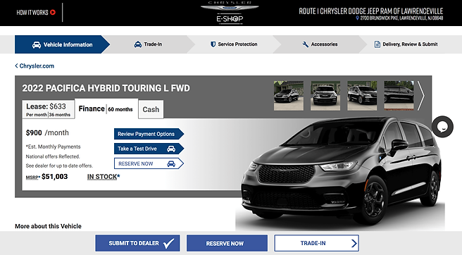
The current Stellantis tool was taking shoppers off site and breaking the user flow
The problem
Dealership websites are notoriously user UN-friendly. Shoppers were seeing offers on vehicles they were interested in, but once clicking the CTA, they were taken to Stellantis' E-shop website and getting lost. Stellantis dealerships wanted to keep them on the site while still converting them to a lead.
The Solution
Good experiences are consistent experiences. A shopper interested in a vehicle should have a consistent experience from clicking on an ad, to landing on the webpage and getting an offer. The solution was to keep all of this on the dealerships page with a widget that would allow the shopper to calculate their offer, and the dealer would get the lead. Win win.

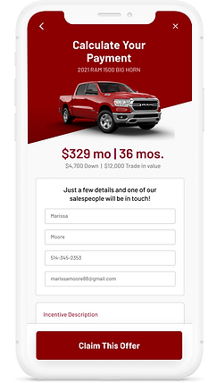.png)
The personas


Technical requirements
I mapped out all of the necessary components of the tool, in order to start wire-framing and to better understand how everything should fit together. The requirements already existed in the current framework, the focus for this project was to make it more user friendly.
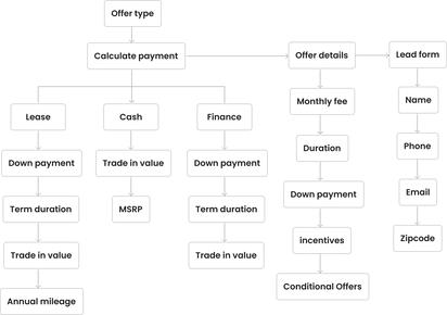
Visual Exploration
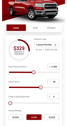
With all the requirements mapped, and understanding how this will be used, I started visually exploring solutions. After sketching ideas on paper it made sense to have the widget slide in (drawer) so the user can fully focus on their task without background distraction.
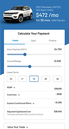


%20(1).png)
Questions
-
How should the payment calculator function?
-
Should the final calculation be next to the CTA or at the top?
-
What's the ideal flow? Lead form and then calculator or vice versa?
-
A lot of information is required to be OEM compliant. How can I keep the design clean and usable?
-
How do I ensure this flow works on mobile? 64% of shoppers will see this site only on mobile.
Final design + Flow
Working with stakeholders internally and externally, the concepts were tested and the final flow was built.
Mobile + Adaptibility
With over 60% of shoppers viewing these sites on mobile devices, designing for mobile was key.

Sticky, large CTA fixed to bottom
Progressive disclosure allows for important content to be accessible in one click

Sizes were adapted for mobile and tested to ensure best usability
The widget slides over the content on mobile so the shopper can focus on the single task

.png)
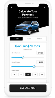
An important part of the design was to keep the visuals adaptable for different OEMs. They had to integrate into an already existing site and colors.
bottom of page
%20(1).png)

.png)